A beginners guide to B2B Website Best Practices 2026
While trying to write what are some of the B2B website best practices, I hit a bit of a creative slump. I went back to the bookmark folder of articles I love to read, and landed where I usually do—The Verge's How Google perfected the web.
Is it the best website design I've seen? I think so. And as a writer, what pulled me in more than the writing was the rigor. Look at how it unfolds, how the sections load, the way the argument is built to be watched rather than read. It's gorgeous!
That's uncomfortable to admit when you write for a living. It's also the most useful thing I know about building a website. A page gets read as a whole before it gets read as a text, and everything around your words is making an argument about whether or not anybody planned one.
So while reading a blog that has nothing to do with designing a B2B website, I found my article.
TL;DR
- Good B2B website design starts with four questions about why the site exists, who it's for by function, what they care about, and what design language they read.
- B2B homepages sound identical because naming what you actually do narrows who you're for, and narrowing feels like turning away revenue.
- A good B2B website strategy is reflective in how your website is structured. Site structure should follow the order a buyer decides in, not your product taxonomy.
What does a good B2B website design look like?
A good B2B website design looks like you've answered four fundamental questions—what the site is for, who you're writing for, what they care about, and how they read design. Once these questions get answered, everything downstream gets easier.
Why does this website exist?
The answer shouldn't be a marketing one. That flows in after. What specific job does it do in how you sell to the world? A site that has to get qualified people into a sales conversation is a different building to one that has to get someone into a product. Most companies build the first and run the second.
It's the cheapest question to answer and the most expensive to get wrong, because B2B website development compounds.
Who are you writing for?
Who is your ICP? And I mean this by function, not by firmographic. "Mid-market SaaS" tells you nothing about what you need to build. "The security lead who's been handed a vendor review they didn't ask for" tells you everything.
Job titles have all the glamour and the aesthetics. Functions have anxieties—pain points to target.
What do they care about?
Do they care about speed and specifications, or design and finish? Do they want the number or the narrative?
Somebody choosing a design tool and somebody choosing a compliance platform are having opposite experiences, and a website built for one will feel wrong to the other in ways neither could articulate.
What design language do they read?
Show one page to three people and you'll get three verdicts. You have to pick one. Skip it and your designer picks for you—not out of vanity, just because somebody has to, and they're the only person in the room with a settled opinion about type. This is the part of B2B web design that gets treated as taste and isn't.
This is your B2B website strategy, and it has to be settled top-down, in a room that includes the person running the company.
How do you design a good B2B website?
The key to designing a good B2B website is being able to translate the answers from those questions into words, colours, fonts, and graphics. This is arguably the most important step in B2B website development and also, the hardest.
Write the positioning sentence.
One sentence that carries all four answers: what you sell, who for, what changes for them, and what makes it different. For example—Compliance automation for SaaS companies under 500 people, audit-ready in six weeks without hiring a GRC lead.
Obviously, this isn’t the headline—it’s the sentence the headline will get checked against. And this should be at the top of your brief. When someone asks whether a section should exist, you hold it up to the sentence. When a designer asks how much personality the brand can take, the sentence answers it.
Decide which pages should exist.
Most B2B sites are too big, and they got that way one reasonable request at a time. Build the inventory first, and rank it by how much of the buyer's decision each page carries.
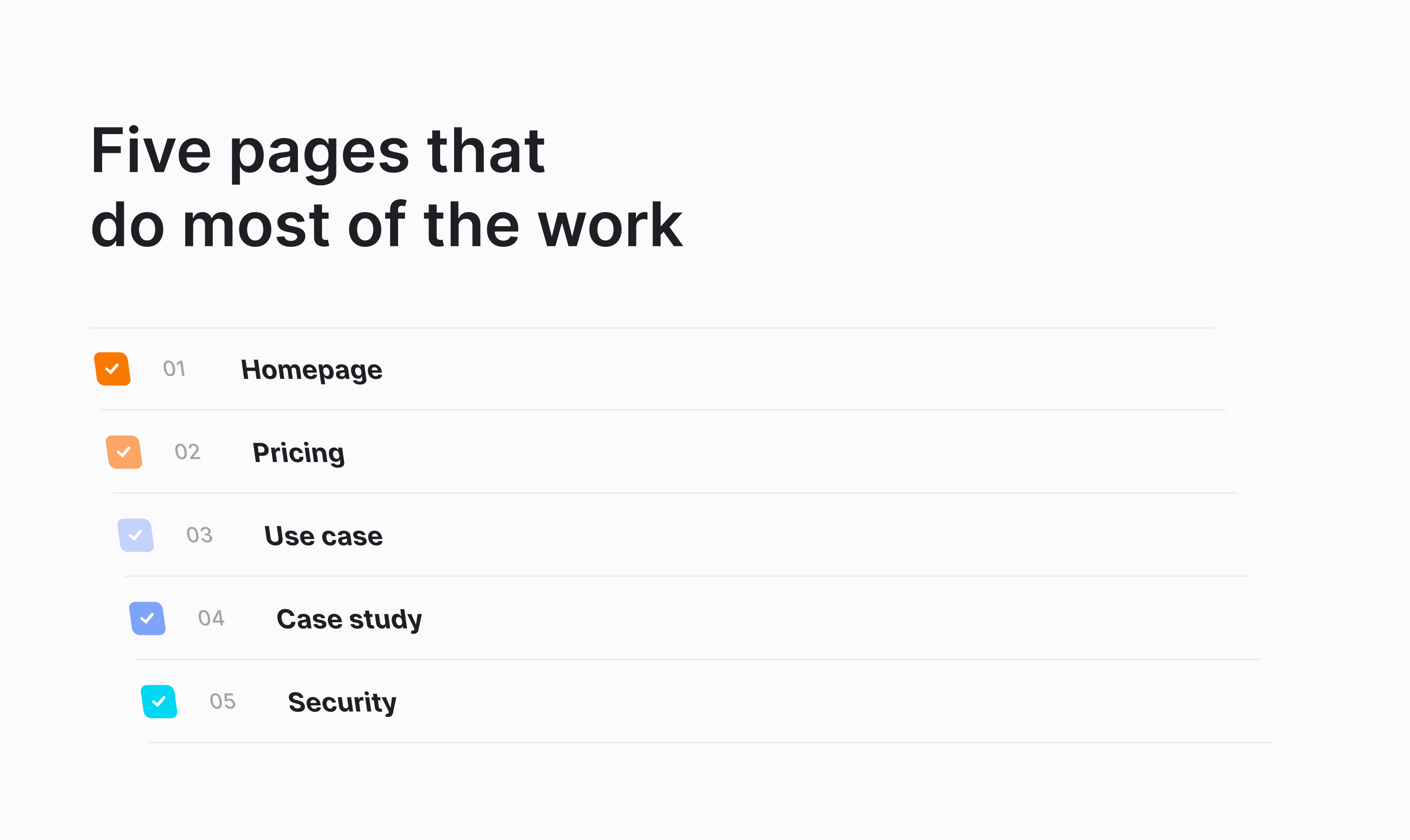
Everything else—the second and third use case, the comparison pages, the glossary, the resource hub—is a later phase that should have to justify itself. Ranking them also tells you where the money goes. The pricing page will out-traffic almost everything you build, and it usually gets a fraction of the attention the homepage does.
Start writing the copy
Do the copy before the design—and no, I am not saying this because I am a writer. Design built around placeholder text produces a layout that your actual copy then has to be trimmed to fit.
This is the single change that most improves B2B web design in practice, and it costs nothing except sequencing. Write the six pages as plain documents. Get them right and hand them over.
The exception worth naming: if a page's whole job is a visual demonstration—a product tour, an interactive comparison—copy-first doesn't apply, because the argument isn't made in sentences. Design and content have to be built together there.
Set the evidence rule
Decide, once, what a claim has to carry before it can go on the site. A reasonable rule: every number needs a source or a named customer, and every superlative needs a reason. Do this at the start and it's a constraint people write inside. Do it at the end and it's an edit that guts three pages the week before launch.
Ensure that every page just has one job
One primary action per page, and everything else visibly secondary. A page offering a demo, a trial, a newsletter and a whitepaper with equal weight has told the visitor you don't know which one you want, and the most common outcome of four equal options is none of them.
The action should match where the page sits in the decision.
Set performance targets for important pages
Set the targets before build and hold them during it: largest contentful paint under 2.5 seconds, interaction to next paint under 200 milliseconds, layout shift under 0.1, measured on visits.
Treating these as a post-launch fix is how you end up with an autoplaying hero video, a chat widget loading 300KB before anyone speaks to it, and six analytics scripts installed by three teams—none of which anyone will remove once they're in, because each has an owner who'll defend it.
Cheaper to refuse them during b2b web development than to negotiate them out afterwards.
Name an owner and a review date
Every page gets a person and a date. Put the review on a calendar rather than a wiki. Quarterly for the six that carry the traffic, annually for everything else. Most B2B web design best practices fail at this step rather than the design one, because launching is a project and maintaining is a habit.
Do all seven and you'll have a website that works. Whether it sounds like you, or like everybody else, is a separate problem.
Why do all B2B homepages sound the same?
Because naming what you actually do narrows who you're for, and narrowing feels like turning away revenue. So the safest sentence wins, and the safest sentence is the one that could belong to anyone.
Writing isn't the same as writing down. Your buyer is frequently more expert than you are, and a platform engineer reading a paragraph that over-explains what a container is has learned something about you. The target isn't simple.
It's unguarded—say the true thing in the shortest honest form, assume the reader is clever, and cut the words that exist to sound serious rather than to mean something.
Jargon is the usual failure, and it's worth being precise about why. Technical terms aren't jargon when your reader uses them daily. They're jargon when they're doing work the writer should have done—when end-to-end orchestration layer is standing in for a sentence nobody wanted to write.
What's the difference between a B2B and a B2C website?
The difference between a B2B and a B2C website has less to do with the way the industry behaves and more to do with structure.
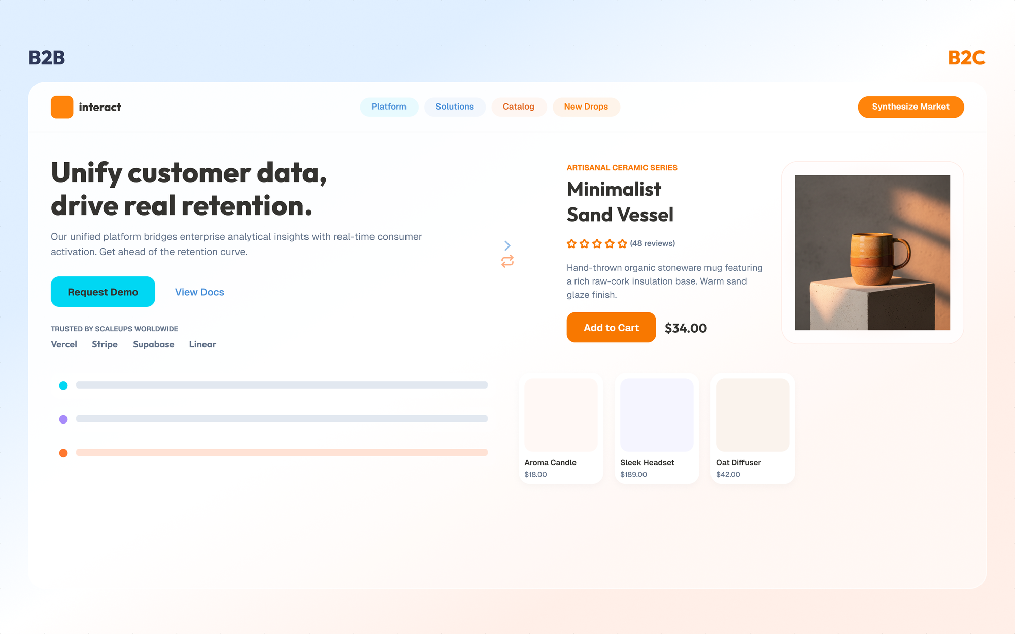
A B2C purchase is usually one person deciding for themselves in a single sitting. A B2B purchase involves six to ten people, by Gartner's count, most of whom will never visit your site—your actual visitor is assembling a case for colleagues in a meeting you won't attend.
That changes what the site has to do. It has to be forwardable. It has to survive being pasted into a Slack thread and read by somebody with no context. And it has to answer questions people might and will have.
But what doesn't change is the person. This is the bit B2B gets wrong constantly, and you can feel it in the writing—the passive voice, the abstraction, the sense that the copy is addressed to an organization. Write to them the way you'd talk to them. That isn't a stylistic preference, it's the whole of it.
Will they believe you?
Social proof is a very important part of any B2B website design. "Increased operational efficiency" is not a result. A case study starts working when it carries a before number, an after number, a timeframe, and a named company—remove any one of those and it turns into bells and whistles. And yes, include what implementation took, too.
The B2B website features that do the most selling:
- Security page
- Product documentation
- Integrations page
How should a B2B website be structured?
You should structure your B2B website around how people decide. Most B2B site architecture mirrors the org chart. Products at the top, split by product line, then Solutions split by whatever the team was called when the page was made, then Resources as a bin for everything else. It's a map of your company. Buyers don't want a map of your company.
They want to move through a decision, and the decision has a shape: does this solve my problem, does it fit a company like mine, what will it cost, can my team actually run it. Four questions in roughly that order. Match your navigation to that shape and people find what they need. Match it to your product taxonomy and they hunt.
You can see this in behaviour. In HockeyStack's study of thirty-one million visitors across eighty B2B SaaS companies, pricing pages pulled roughly thirteen times more traffic than demo pages and bounced at half the rate. People go, in volume, to the page that answers a question they have, and they turn around at the page that asks them to talk to someone.
And none of this happens in a linear manner. The loop crosses devices, too, which is the part responsive website design in B2B usually gets backwards.
So what makes a B2B website work?
Everything on it agreeing about who it's for. From the headline to the unpublished pages, all of them are answering the same question, and when the answers match, a stranger can tell in one read.
That agreement is the whole point of the four questions, and it's why they get settled before anyone opens a design tool. Most B2B website optimization happens after launch—the tests, the heatmaps, the arguments about button colour—and all of it runs on a foundation poured before anyone wrote a word. No amount of iteration moves a foundation.
I keep coming back to that Verge piece, and to how completely it had convinced me before I'd read enough to be convinced by it. That wasn't a trick anyone played on me. It's what every page does—the pacing, the whitespace, the fact that nothing shifted under my thumb as it loaded. Yours is doing the same thing right now, to somebody, and it's landing well before they reach the sentence you spent a day on.
Your website is talking whether or not you wrote the script. All the questions above do is give you a vote in what it says.
FAQs
How does a B2B website differ from a B2C website in design and strategy?
A B2B website is designed to help one buyer sell a solution to an internal committee of 6 to 10 stakeholders, whereas a B2C website is built to convert a single individual making a decision for themselves in a single sitting.
Because B2B buying decisions carry higher risk and multiple approval layers, a B2B site must be easily forwardable into team channels like Slack. It must prioritize functional clarity, upfront pricing, security documentation, and role-specific proof points over high-pressure consumer sales tactics.
Why should you write copy before designing a B2B website?
You should write copy first because designing around placeholder text forces your actual messaging to be trimmed or stretched to fit arbitrary visual layout boxes. Writing plain-text copy before design begins ensures that visual elements, layout, and typography are built specifically to support your core positioning and value proposition.
What core pages belong on a high-converting B2B website?
A high-converting B2B website relies on five core pages that handle the vast majority of the buyer's decision: the Homepage, Pricing, Use-Cases, Case Studies, and Security. Secondary assets like comparison pages, resource hubs, and glossaries should be phased in later only if they justify their ROI. Focusing on these five essentials prioritizes the highest-value touchpoints—especially the pricing page, which regularly attracts significantly higher traffic and lower bounce rates than standard demo request forms.